Our new brand represents the work of Rotorua Trust in a simple yet meaningful way.
Since it was established in 1994, the Trust’s look and feel has evolved to reflect the work the Trust does and the community it represents. This is the Trust’s fifth rebrand.
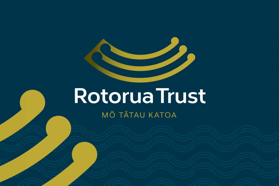
Rotorua Trust exists to create a better Rotorua for all, and this is reflected in the brand’s new strapline – Mō tātau katoa | for all of us.
Through its curved lines, the logo reflects the key aim of the organisation, which is to effectively and responsibly manage and grow its assets to create a better Rotorua for all, making a difference now while leaving a legacy for tomorrow.
The lines also represent the balancing act that exists between careful investment and providing funding for the community. They also represent the positive impact the Trust has on the community – giving Rotorua something to smile about. The koru at the end of each curve represent growth in both our funding and the community.
The new brand reflects all these elements, while weaving through a Māori cultural element that better reflects Rotorua and its people.
Blue is a friendly and welcoming colour and gives a nod to the fact that Rotorua is surrounded by lakes, while the gold represents investment – without which the Trust would not exist.
The refreshed brand supports the Trust’s updated strategic plan and vision – to achieve a better Rotorua for all – and its priority areas, which include healthy families, education and employment, strengthening communities, vibrancy – arts and sports, environment and climate change, with a special focus on family harm and housing.
Rotorua Trust’s revamped website showcases the new brand and has been redesigned to provide you with a seamless, enjoyable experience.